12 Visual Strategy Questions Every Brand Needs to Answer
If your brand isn’t connecting, it’s not because you need a fancier logo or more colors. It’s because your visual strategy isn’t clear yet.
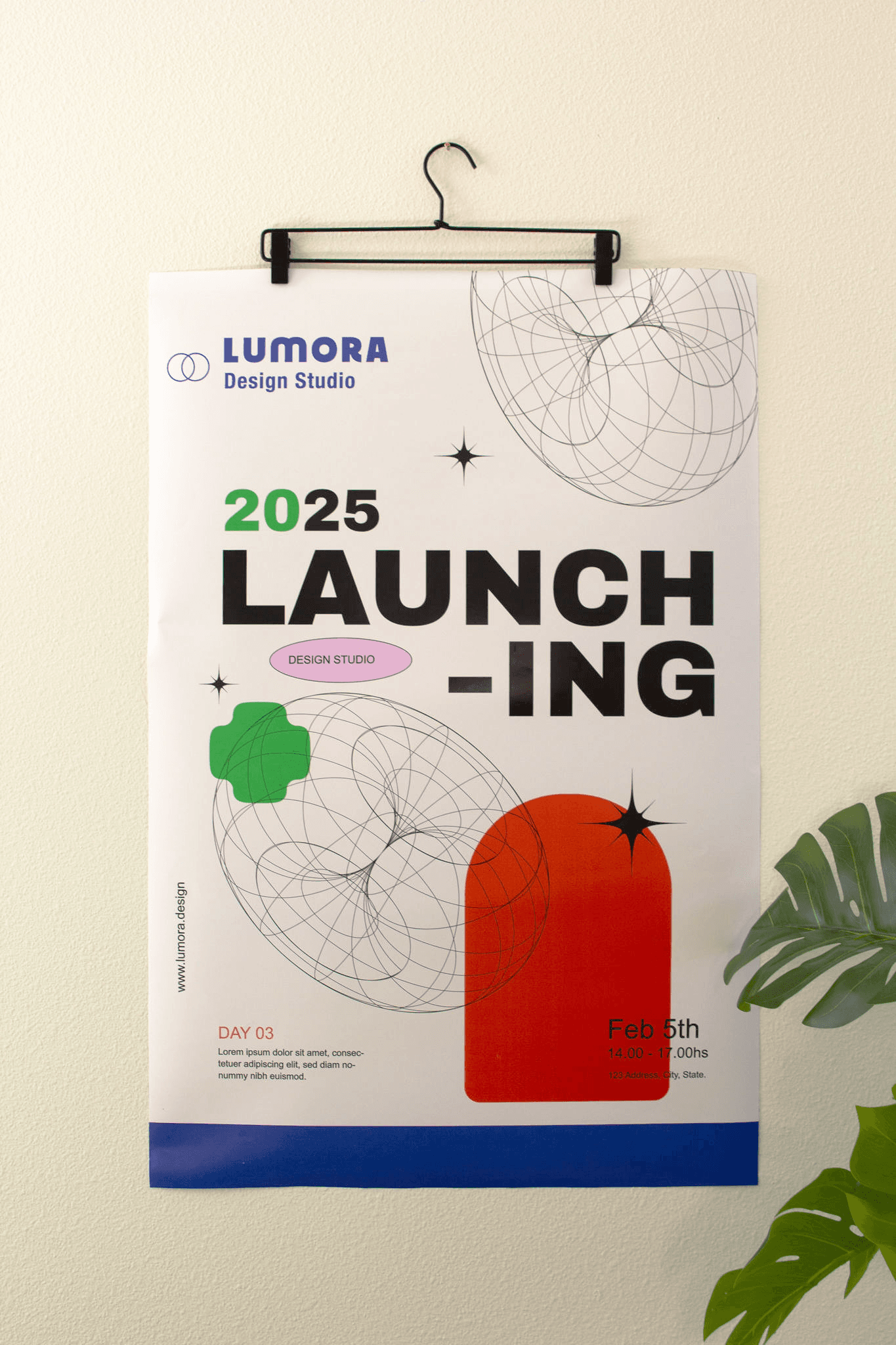
At Lumora Studio, we ask these 12 powerful questions before designing anything. These aren’t just nice-to-ask questions. They’re the ones that help your brand stand out, build trust, and stay unforgettable.
Let’s break them down 👇
1/ What’s the first impression your brand gives in 3 seconds?
People are busy. On average, you have less than 3 seconds to make a first impression online.
So what does someone feel when they see your Instagram feed, your website homepage, or your packaging?
Do they feel excited? Calm? Confused?
If they don’t understand who you are or what you do right away, you’ve lost them.
💡 Pro tip: Ask someone unfamiliar with your brand to look at your site or Instagram for 3 seconds and describe it back to you. Their answer will tell you a lot.
2/ What would your brand look like if it had a personality?
Imagine your brand as a real person. What would they wear? How would they speak?
Are they bold and full of energy, like a creative friend who hypes you up? Or are they calm and reliable, like a therapist who makes you feel seen?
When you understand your brand personality, your visuals get easier to build, because you’re just dressing and expressing that “person.”
📌 Example: A wellness brand with a “gentle healer” vibe might use soft, organic colors, handwritten fonts, and warm photography.
3/ Are your visuals helping people remember you?
Good design is nice. But memorable design builds a business.
Think about some of your favorite brands. You can likely picture their colors, style, or packaging without even seeing the logo. That’s because they’ve created a strong visual system that’s consistent and unique.
🎯 The goal isn’t just to “look pretty.” It’s to be recognizable.
💡 Try this: Choose one or two signature elements like a custom pattern, filter, or color combo, and use them everywhere.
4/ What do your top 3 competitors all look like, and how will you look nothing like them?
Your competitors are a goldmine for strategy.
Don’t copy them. Study them! Look at their colors, logos, and layouts. Ask:
What do they all have in common?
Where do they all feel the same?
What’s missing?
That’s where your opportunity is.
Your brand shouldn’t just “fit in.” It should stand apart in a way that still feels trustworthy.
🎯 Example: When designing for a Pilates studio in a market full of muted, minimal brands, we went the opposite way: elegant typography, ocean-toned gradients, and lifestyle photos. Same market. Fresh perspective.
5/ Does your visual branding make people feel safe buying from you?
Trust is built visually before a single word is read.
Ask yourself:
Do my designs feel clean and clear?
Is my site easy to use?
Do my photos feel real and consistent?
If your visuals feel messy, outdated, or low-effort, even the best product or service won’t feel trustworthy.
🔐 Brand tip: Invest in polished visuals. Clean layout, consistent spacing, and high-quality images make people feel like you know what you’re doing.
6/ Does your visual style support where your brand is going?
Brands grow, and your visuals need to grow with you.
A DIY look might have worked when you started out. But now, if you're:
Raising prices
Launching a new product
Speaking to a more premium audience. Your brand needs to reflect that next level.
🚀 We see this a lot: Clients are ready to scale but still using visuals from when they were “just starting out.” Upgrading your style to match your ambition tells your audience: We’ve grown. We’re ready.
7 What makes your brand different?
This is your positioning, and it’s one of the most important pieces of your strategy. If your brand looks and sounds like everyone else, why should someone choose you?
Answer: They won’t. The goal isn’t to be better. It’s to be different. And your visuals should show that difference clearly.
📌 Look at your strengths: Are you faster? Friendlier? More holistic? More luxurious? Translate that into your color palette, layout, and brand vibe.
8/ What’s one visual rule your brand follows that no one else does?
Strong brands have structure.
That doesn’t mean being boring. It means being recognizable.
Maybe your rule is:
Always using vertical type.
Only posting with a tan background.
Never showing people’s faces.
Always using shadow play in product photography.
Whatever it is, that one consistent visual rule becomes a signature.
People start to associate that visual cue with you.
9/ What part of your brand can’t be copied?
In a world of templates and trends, originality wins.
Trends are easy to mimic. But no one can copy:
Your voice
Your values
Your founder story
Your creative process
🎯 Build your brand visuals around that.
Your photos, layout, colors, and design should all reflect something personal and real. The thing that only you can bring to the market.
10/ What visual mood does your brand always stick to?
Your mood = your emotional tone.
And it needs to be consistent everywhere. Your website, your social posts, your packaging, your emails.
When the mood keeps shifting, your brand feels confused.
When the mood is locked in, your brand feels confident.
11/ If your brand was on a shelf, would it be the one people grab?
Think beyond Instagram. Imagine your brand sitting on a store shelf next to 10 others.
Would someone pick it up, or walk right past?
Good design grabs attention.
Great design holds it.
12/ Does your brand look intentional or just put together with whatever?
This is the difference between being seen as a business and being taken seriously as a brand.
Random = amateur.
Intentional = professional.
If you’re using five different fonts, unclear colors, or changing styles week to week, your audience can feel that inconsistency. Even if they can’t name it.
👁️ Quick fix: Set a style guide. Define your core brand elements and use them everywhere. When everything feels aligned, your brand becomes magnetic.
Final Thoughts 💡
Great design doesn’t start with visuals .It starts with clarity.
If your brand isn’t working the way you want, don’t jump straight into a redesign.
Start with strategy. These 12 questions will help you see where your visuals are off, and how to realign them with what makes your brand truly special.